
CASE STUDY
BARTER COFFEE ROASTERS
Role: Art Direction, Design // Client: Barter Coffee Roasters
To barter is to trade, to exchange, not only in terms of goods, but also the way conversations, values and morals are shifted. Barter Coffee's mission is to produce beans of fair and direct trade, pushing relationships and third wave coffee to new boundaries.
We are tasked with developing an identity system that truly represents Barter's unique aspirations and values, allowing them to be memorable among their many competitors.
Thanks to the client's clear vision and passion, we quickly determine Barter's core values and brand positioning as a starting point.
CORE VALUES
INSPIRING
HIGH-QUALITY
WARM
CORE AUDIENCE
We identify Barter Coffee's target audience as young professionals in their 20s and 30s, who are conscious about making ethical choices and willing to refine their taste in quality goods. They are interested in a brand's transparency and authenticity, often do their own research before making their buying decision.
POSITIONING
Knowing their consumers, Barter doesn't shy away from the hip, modern, small-batch aesthetics, instead, they are willing to embrace it over the coldness of corporate branding. Our main challenge stems from keeping the design modern, while injecting charm and warmth, to convey Barter's community-oriented values.
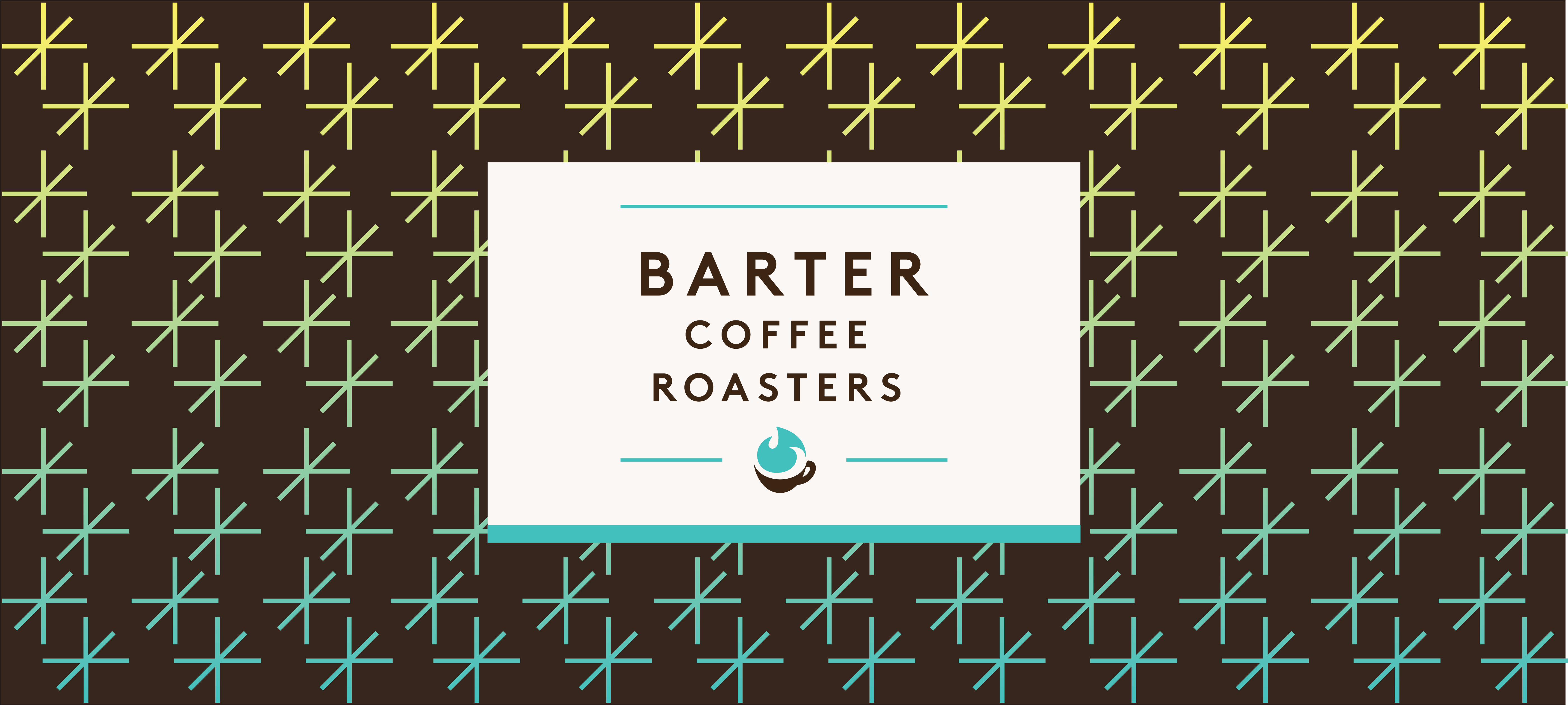
Solution #1
This first option has a youthful and energetic color palette that embodies the flame of inspiration that Barter ignites. Secondary elements made of arrows coming together to form sparks pattern suggests the act of barter in a subtle and abstract representation.
Solution #2
The second concept draws inspiration from vintage wood crate typography, which evokes an era when international trade was whimsical and inspiring. Vintage inspired typeface also suggests tradition and craftmanship.
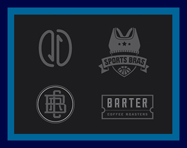
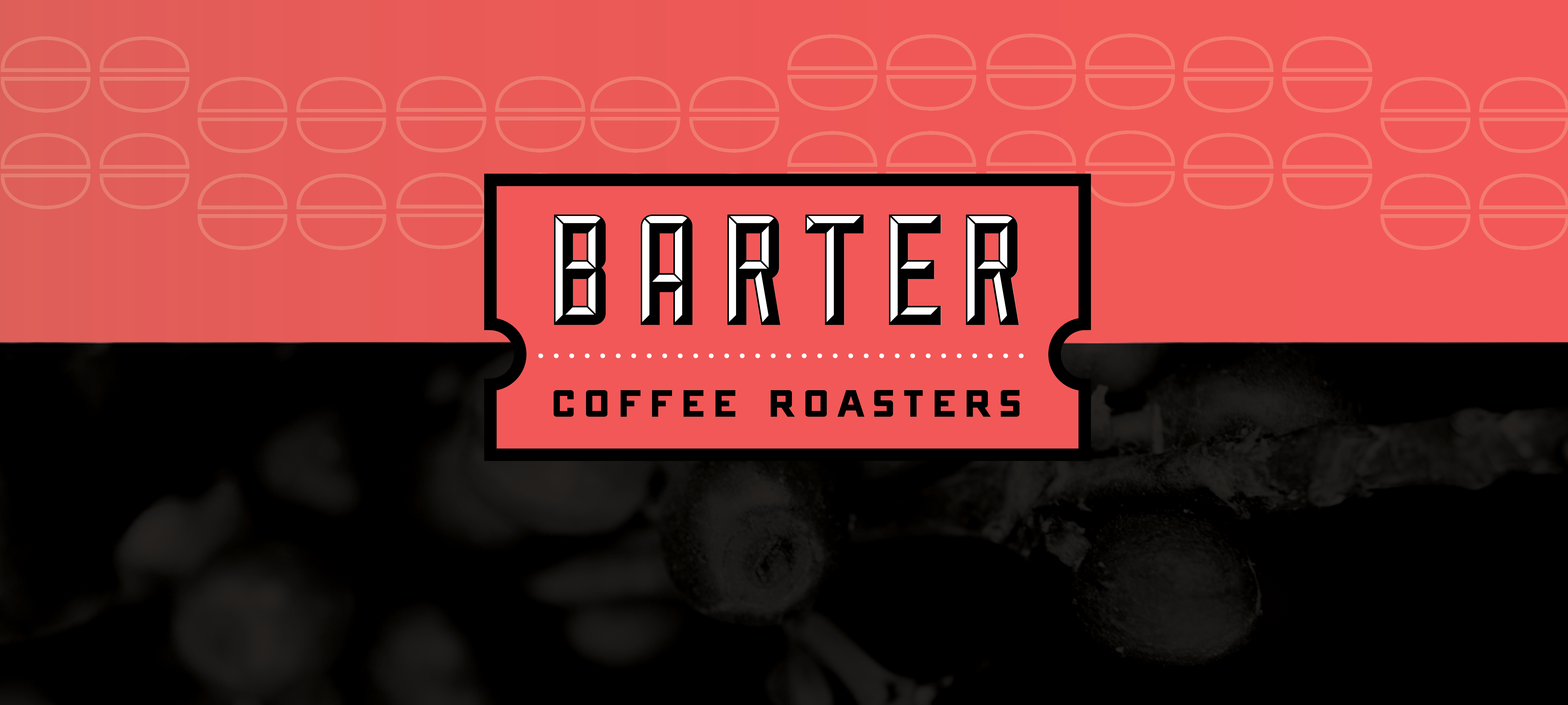
Solution #3
This concept starts with the idea of tickets: To travel is to barter, to exchange new ideas and to be inspired. Vintage wood block typeface suggest tradition and craftmanship. The logo in this direction is placed between two different representations of the beans to convey the bridging of ideas, starting a connection.
Solution #4
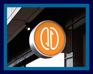
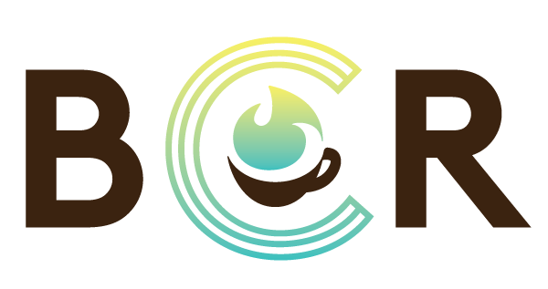
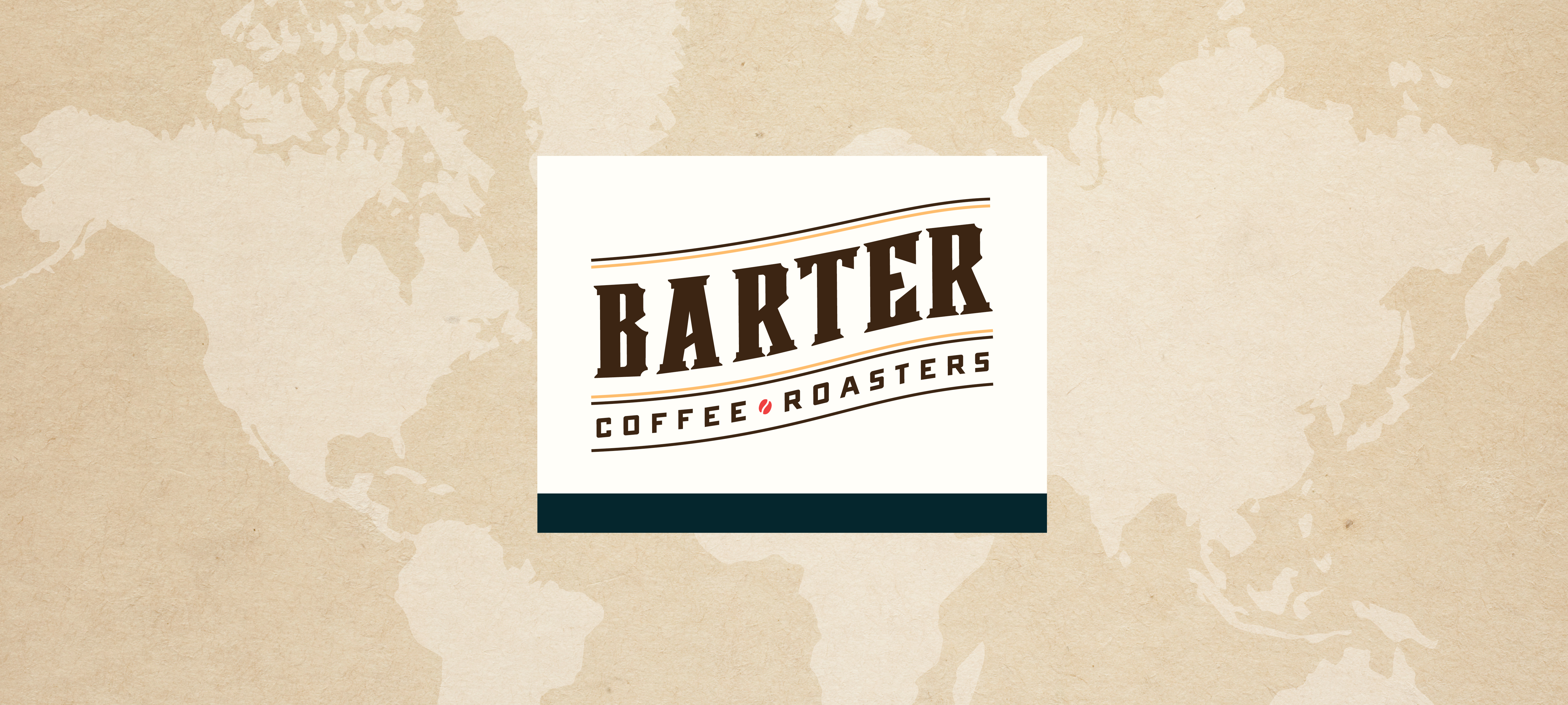
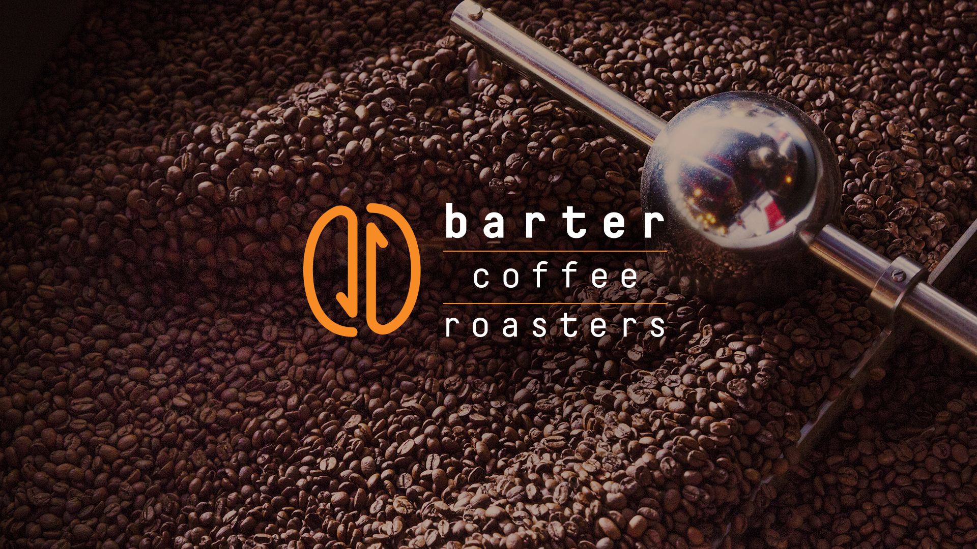
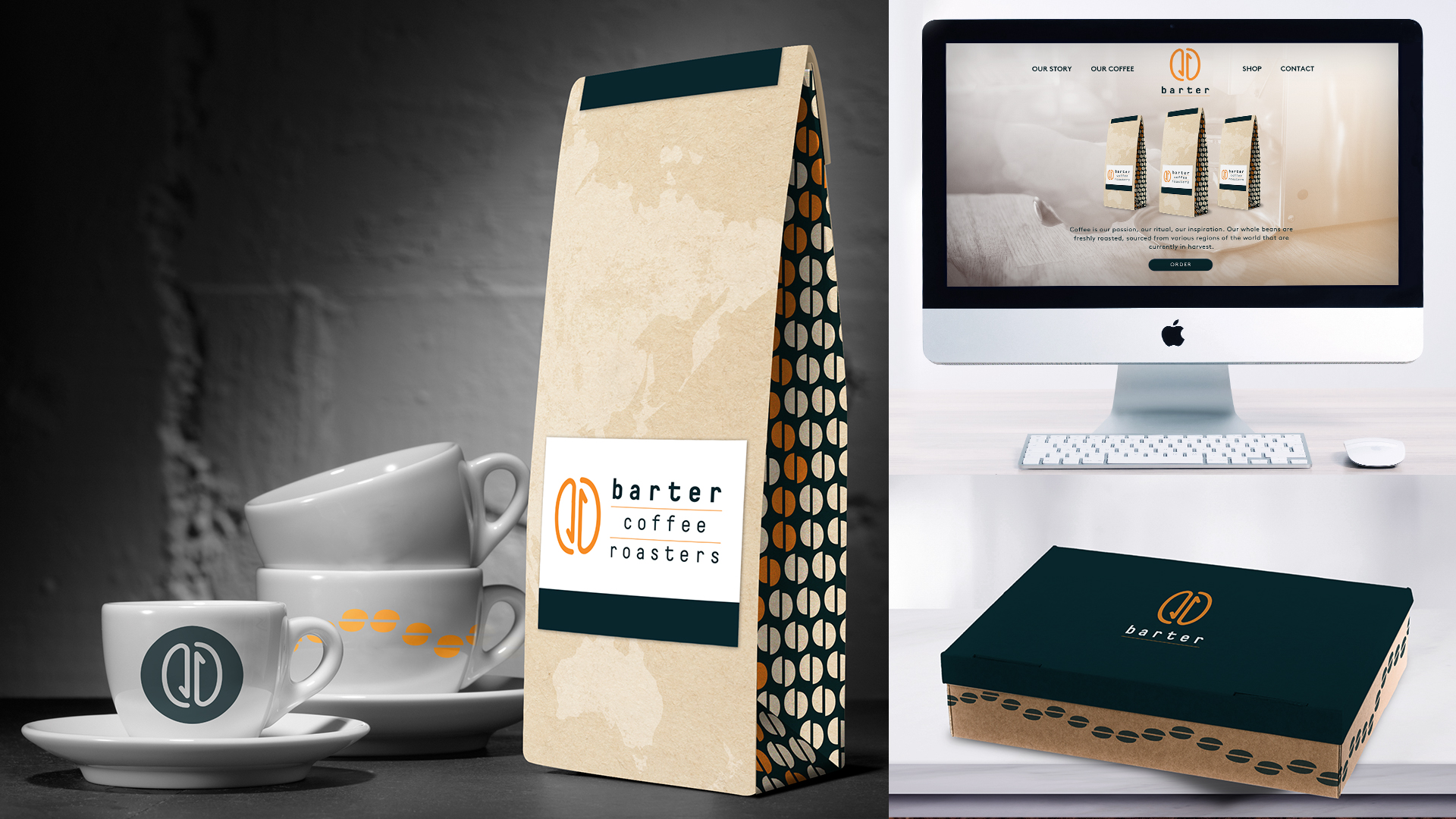
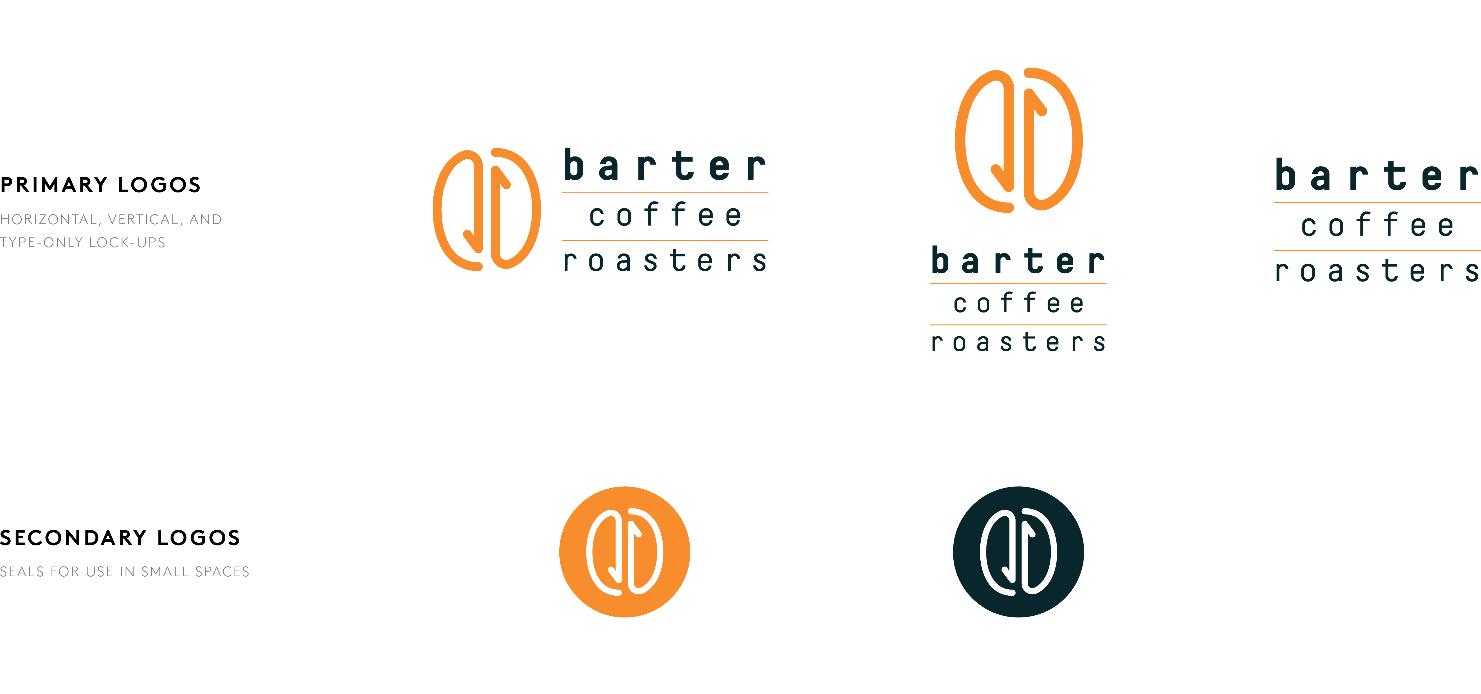
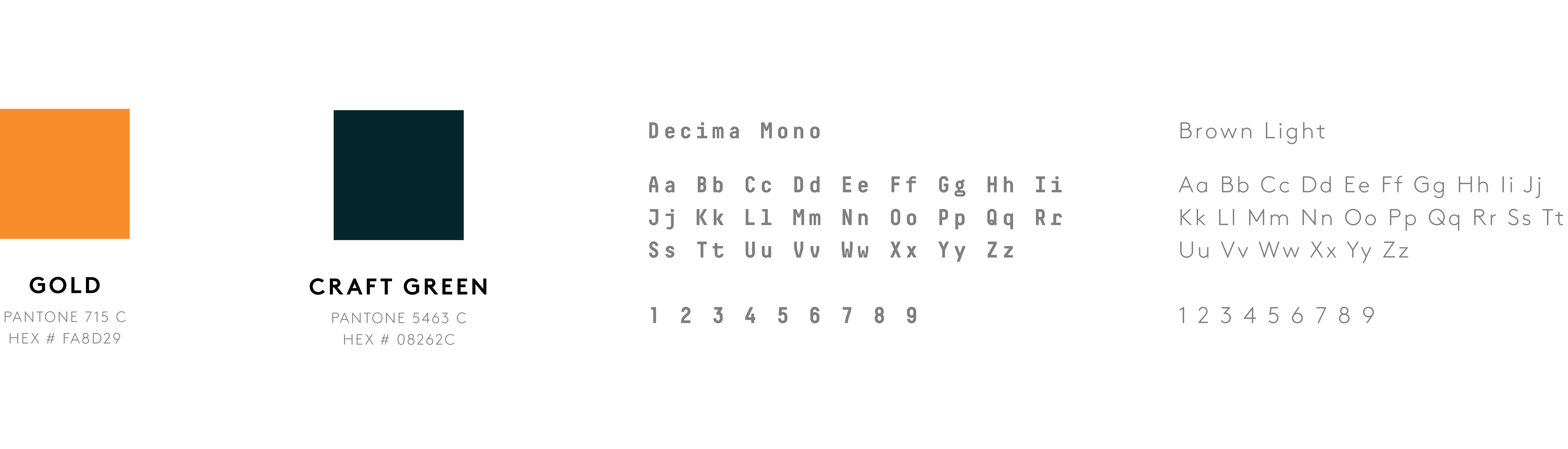
This logo mark is inspired by the movement of coffee beans in the roaster as well as the action of barter. Monospace typeface invokes artisanal look and feel. Classic and neutral color palette gives a traditional, trustworthy message. Secondary elements including the traveling line and topographic texture highlighting the journey of the beans and the aspiration to travel and exchange of ideas.
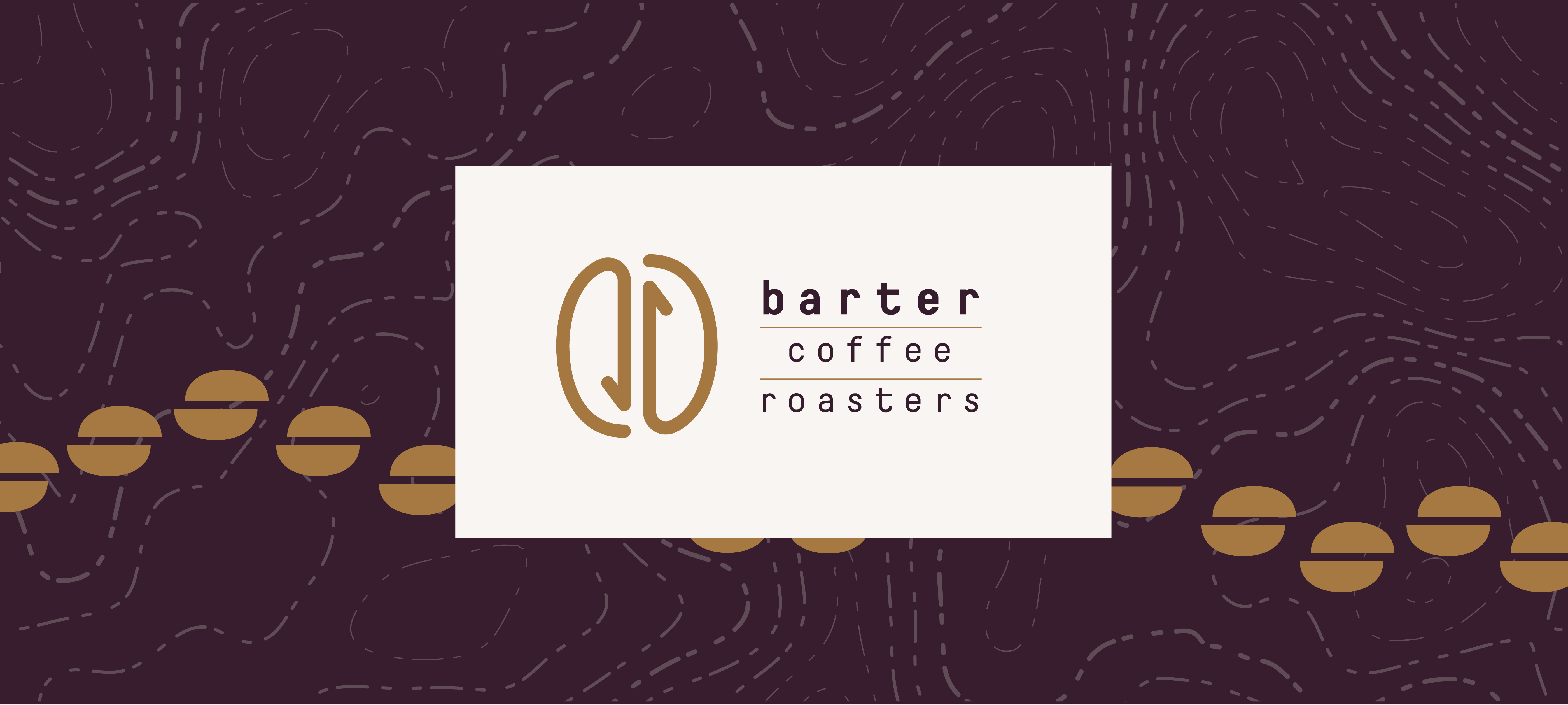
Final Design
Conclusion
In the end, we weigh the pros and cons of all solutions and decide that option #4 is the best approach. The logomark is simple yet effective with its dual concept, and scales well in most scenarios. The typography lock up conveys the right tone and message, and also unique enough to be used on its own. We go with a flexible and timeless color palette and secondary elements, which are ready to appear on various marketing and packaging materials.