CASE STUDY
BRAINTREE CUSTOMER
EXPERIENCE DEMO
https://demo.braintreepayments.com/
Role: Art Direction, UI Design // Client: Braintree Payments // Agency: CP+B LA
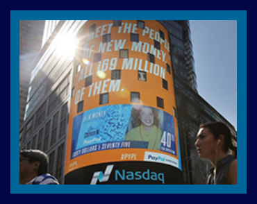
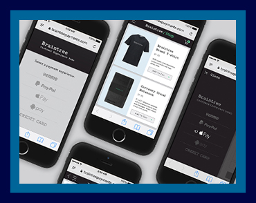
Braintree Payments is a company that specializes in mobile and web payment systems for ecommerce companies. As a part of their client outreach, Braintree tasks us with developing a demo platform to show how easy it is for customers to pay while they're shopping online. The app walks users through the checkout process using five different payment methods: Venmo, PayPal, Apple Pay, Android Pay, or credit cards.
CORE VALUES
MODERN
SEAMLESS
INTUITIVE
CHALLENGE
Not only is it meant to be used by sale reps, the app is also sent to potential clients to try on their own, thus, we want every piece of communication to be clear, simple and intuitive. Visually, the app needs to fall under the Braintree branding, a tech company that is bold, modern and innovative.
ROLE
As the visual designer, I'm responsible for creating the identity and visual system for the app, developing assets and prototypes throughout the process. I work closely with the UX designer to develop user flow and wireframes, with the account team to address client's needs and feedback, and with developers to ensure the final product's quality and function.
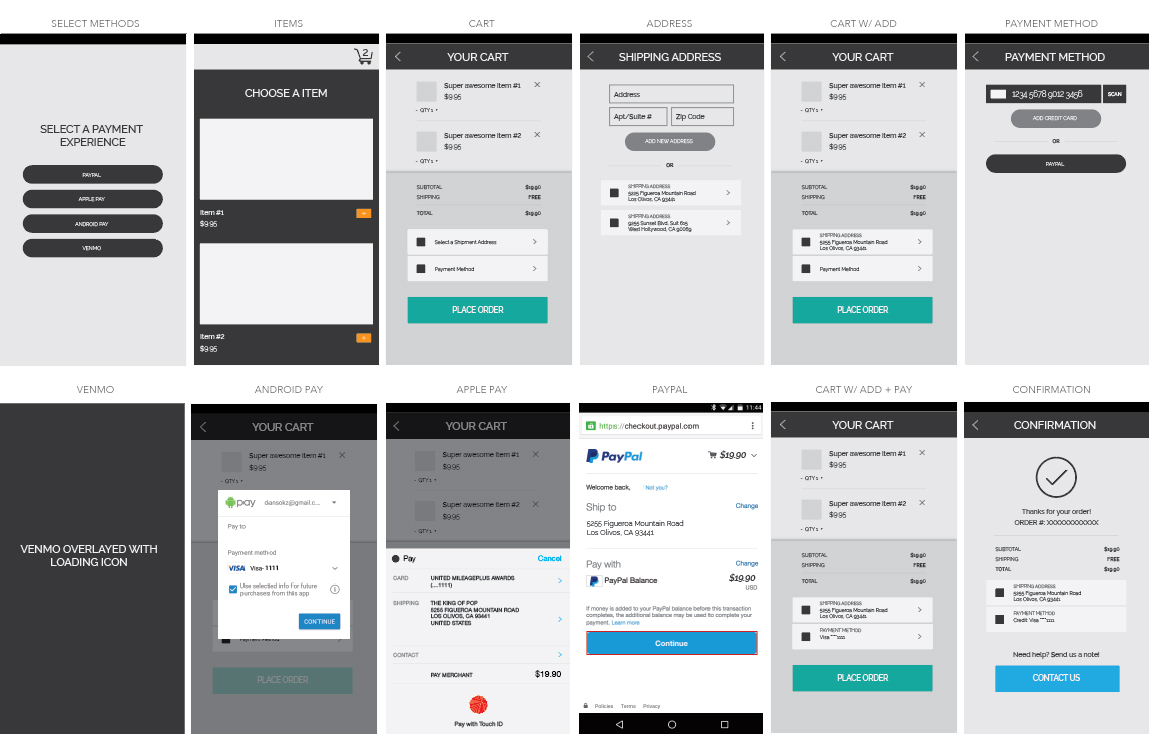
Wireframes
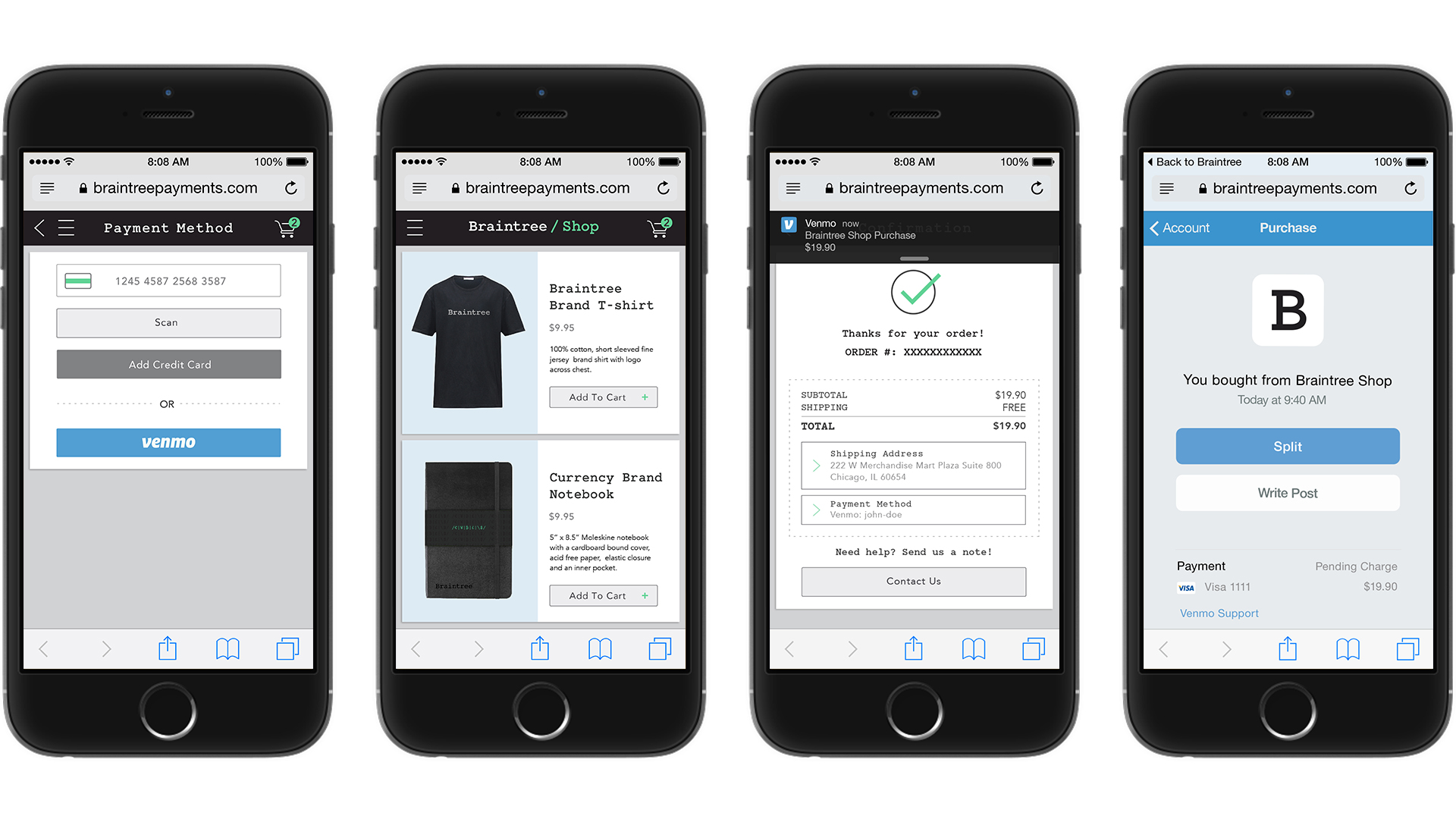
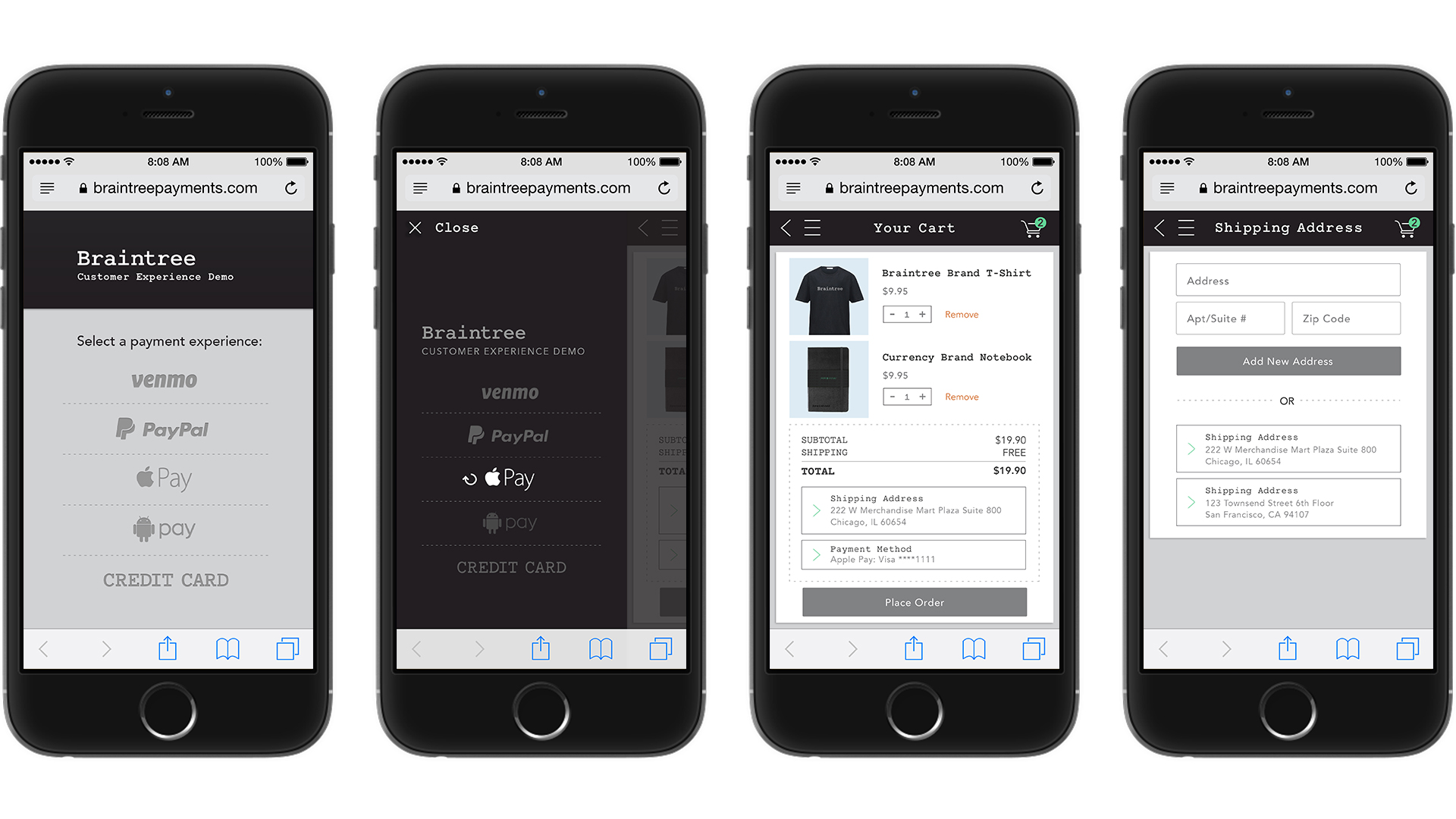
We create a demo ecommerce shop with a straightforward user flow: Visitors to the shop are able to add items to their cart and check out with their chosen payment method and shipping address. High-fidelity wireframes are created and made into an interactive prototype via InVision for client approval.

Moodboard
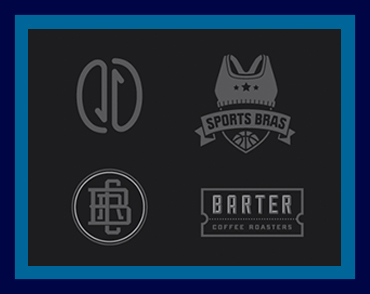
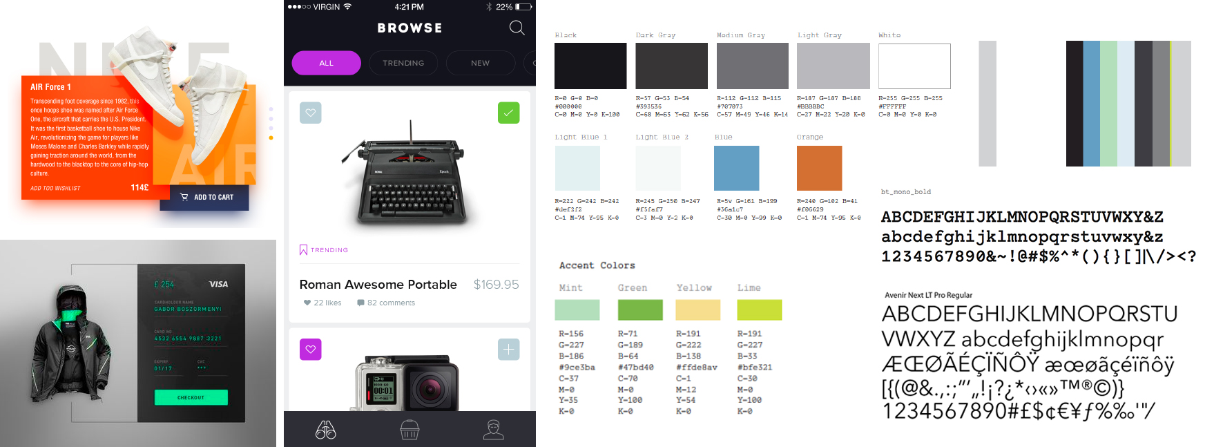
Having worked with the brand, we have a pretty good idea for the look and feel of the web app when consolidating elements for the moodboard. We decide to keep typography and color pallette consistent with Braintree's website. At the same time, we identify constraints of the mobile ecommerce format, and start to create a small pattern library that become the guide for the project.

Prototypes
Two visual directions are created initially using the Venmo flow to receive feedback on what components feel right for the brand and the demo's purposes. Through multiple iterations, we simplify to keep the process as clean and easy as possible, as well as conveying Braintree's modern approach.


Final Design
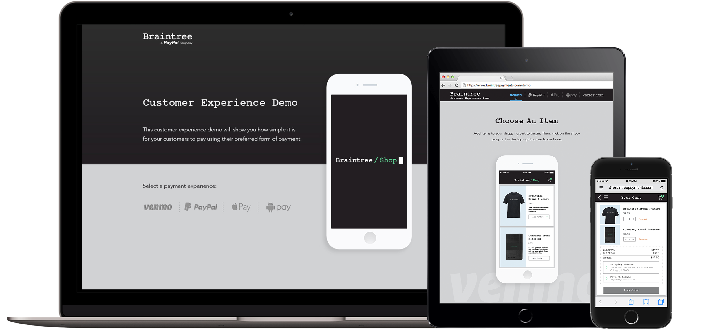

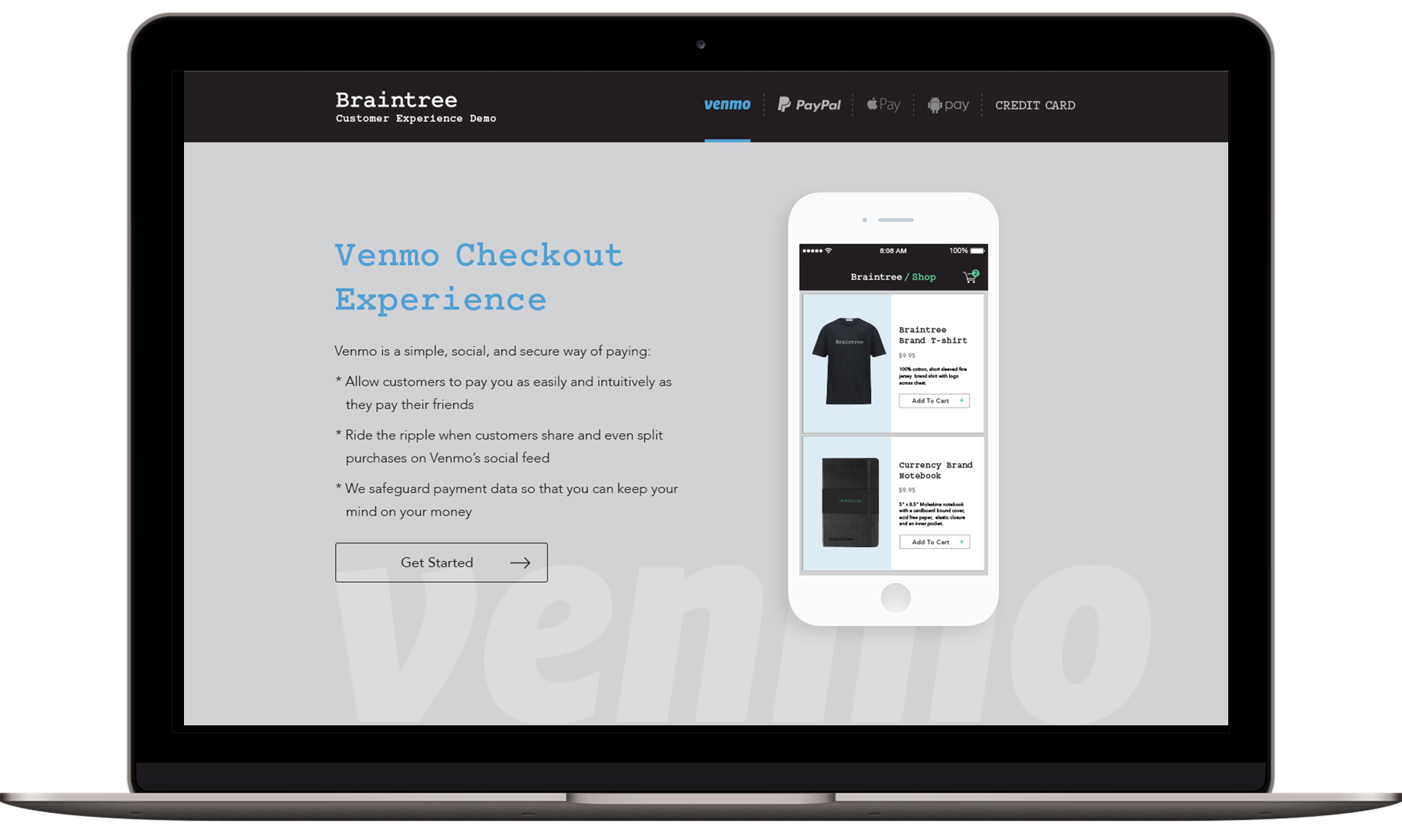

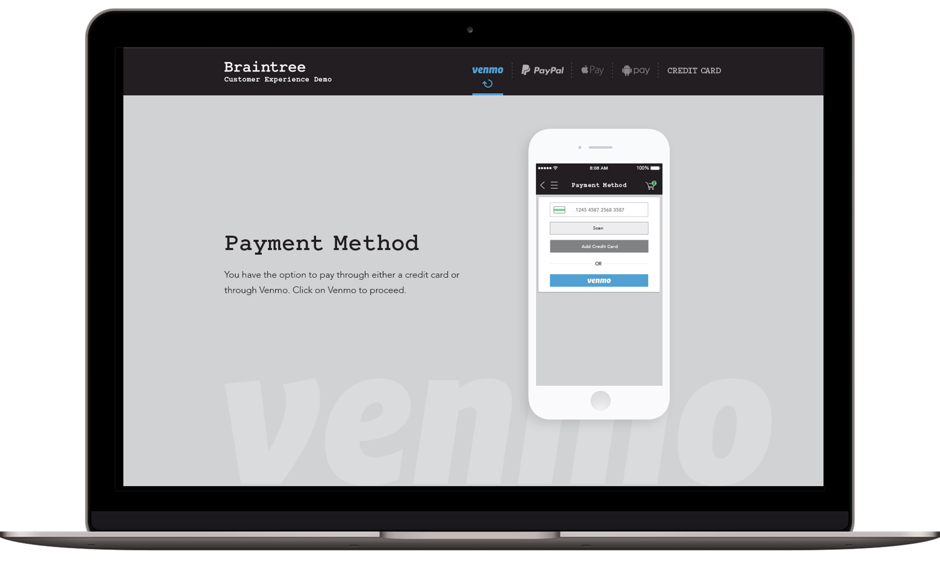

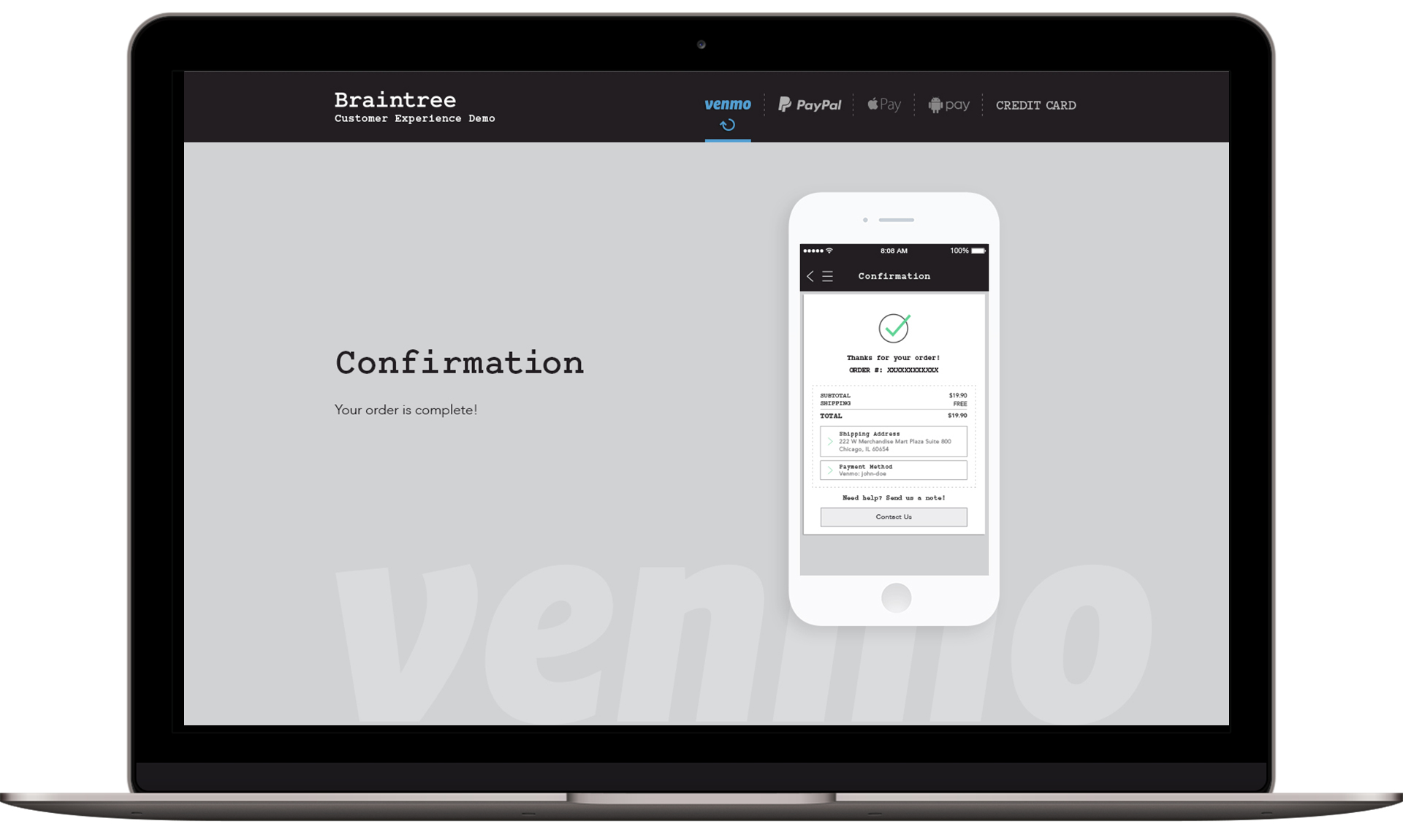

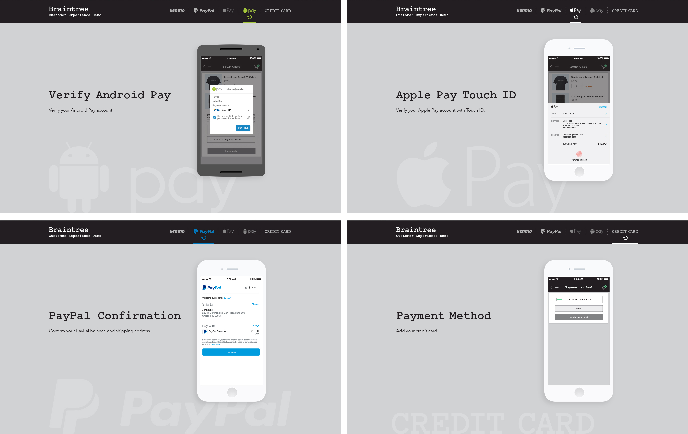
Desktop designs are built with explanations added to each step of the process, illustrating the five payment method's differences and Braintree's role in integrating them. Users have the ability to restart their process or start a different one from the navigation bar.



"Ping" Animation
Since the demo will be sent out to potential client to interact with on their own, Braintree wants the process to be as clear and frustration-free as possible. "Ping" animations are added as clues for users to navigate to the next steps if they're idle for 5 seconds.
Reflection
Braintree Customer Experience Demo is not the most extensive project I have worked on, but it is the first on which I've been the lead designer and have utilized the digital design thinking and process to great effect.
The project allows me to take ownership and go through the entire process of creating a cohesive and comprehensive design system. Many lessons have been learned and challenges overcame, from taking into account constraints accross many different platforms, to addressing client's feedback and implementing last minute requests, as well as communicating with developers. These valuable experiences help me optimize my process and become more confident in my practice going forward.

